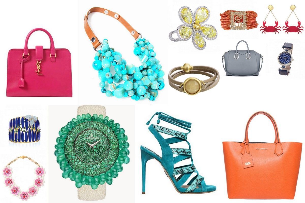
Custard, strawberry ice, toasted almond, it sounds like the tastes you would find in an ice cream salon! But they are the tasty names of the hottest colors in fashion this Spring. On Bizzita today, a compilation of those colors combined with fashion, jewelry and accessories. Get your inspiration here!
1. Marsala
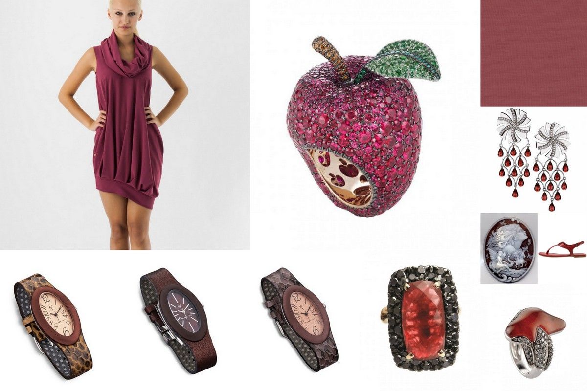
Named after an Italian wine, originally used in Tiramisu. This deep warm red color has a brown undertone and is somehow a very mature color. Not something you would choose for a young girl perhaps. It has a kind of serious, but interesting air of maturity.
2. Custard
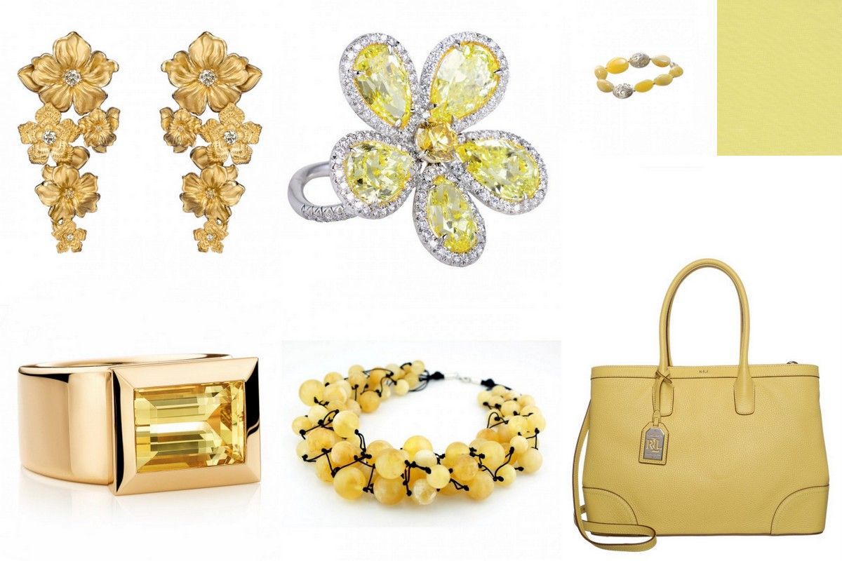
An easy color for anyone to wear. It does not the kind of yellow that knocks you off your socks. Every summer I try it again, seem to never learn that bright yellow is definitely not my color, but it is the relation that we link to this color with the sun, that is so tempting. Custard is much softer, kinder...and I probably can wear it even too!
3. Tangerine
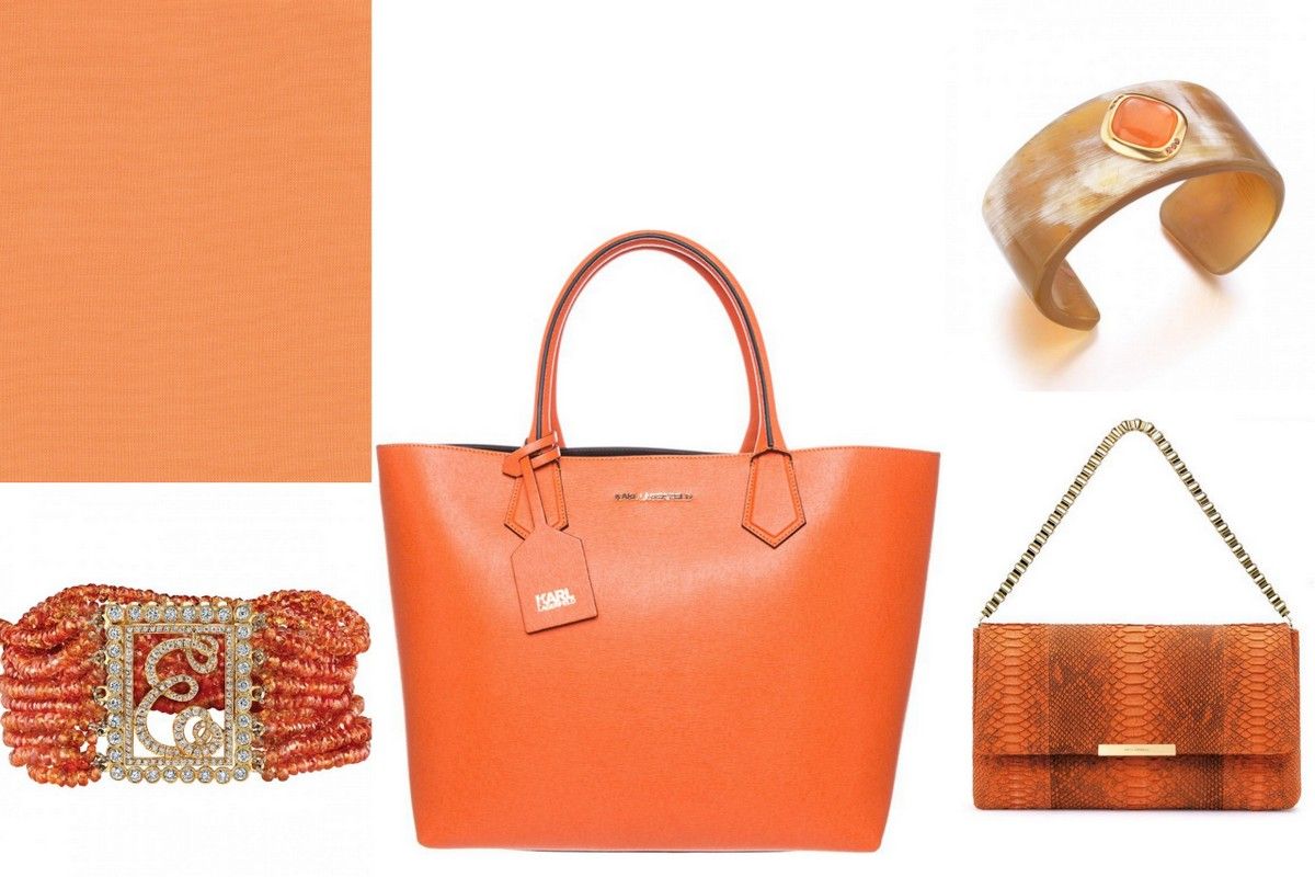
A color with a tangy edge, yet friendly and suitable for almost everyone. This beautiful color can lift you up. Looks great on your lips and even lifts up the palest of skins. Tangerine is uplifting!
4. Glacier Gray
A soft kind of grey. Although grey may seem just a lighter version of black, it really can be very soft and flattering. A color that is easy to mix with a much brighter color, or as the base for adding more pastel colors. The choice is yours. I LOVE grey.
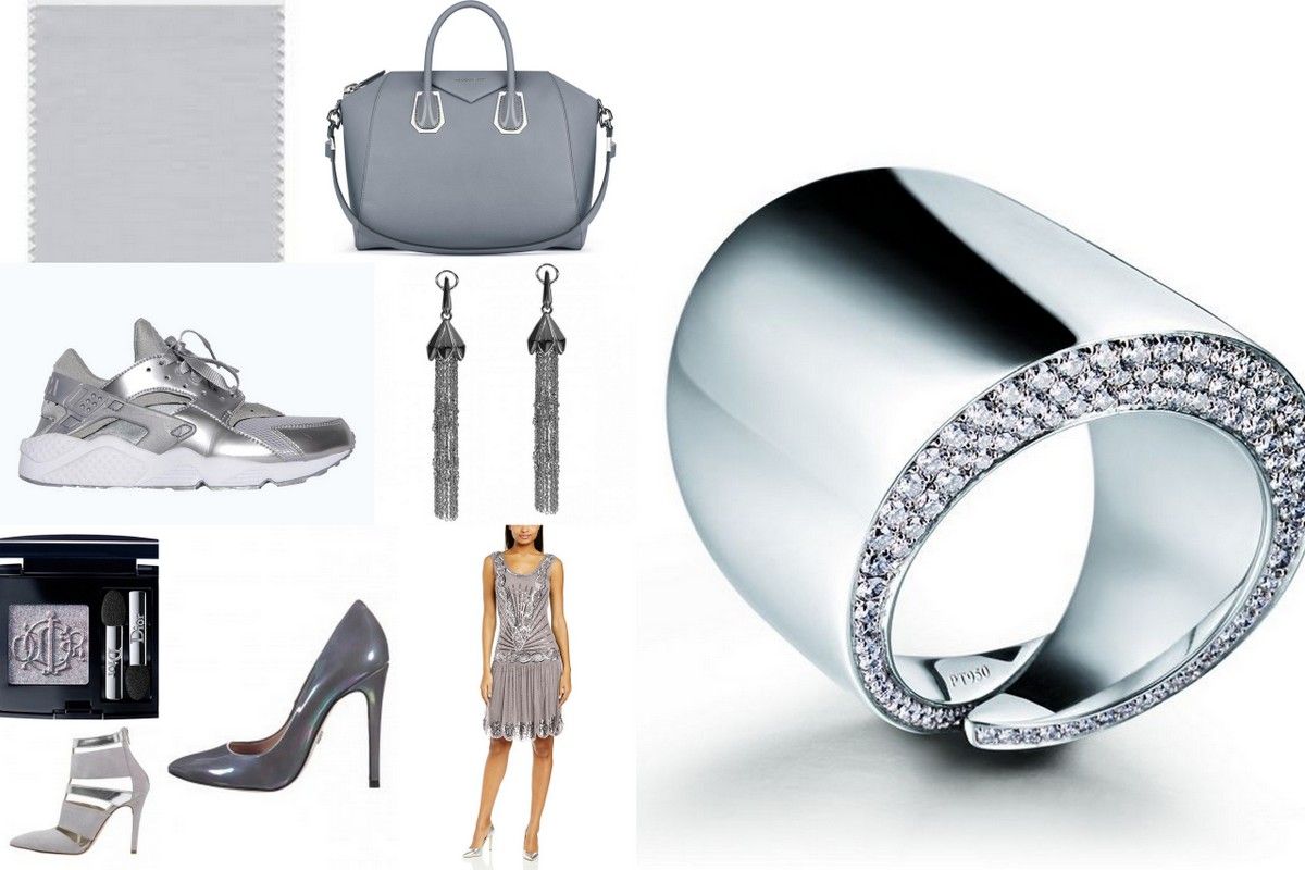
Glacier Gray: the beautiful bag is so versatile for every season really. Made by Givenchy. The sneakers: Nike Air Huarache Mettalic Shine, Make-up by Dior ( I think Dior has one of the best eye shadows) Chandelier earrings by Stephen Webster, the beautiful ring is in platinum, by Valenza Jewelry company Vhernier. The shoes: the light grey one is by: Mai Più Senza and the high heel by Dutch company: Supertrash.
5. Toasted almond
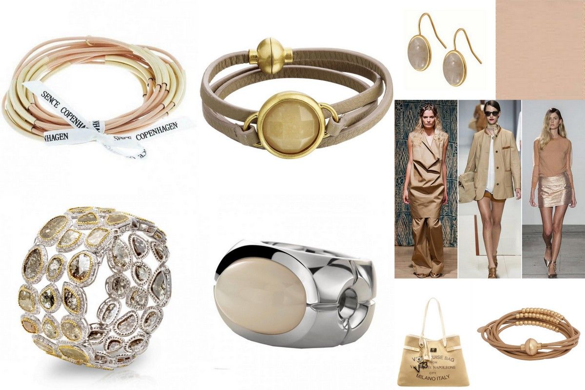
I immediately think: Max Mara coat. No idea why, but this color is that kind of camel coat mix trench coat idea. Neutral, so never out of place. If you are not sure what to wear to a job interview, a sales meeting or any place that you are not sure what the dress code is, wear Neutral! It is a smart woman’s choice, mature and very soft, yet not girlie.
6. Strawberry Ice
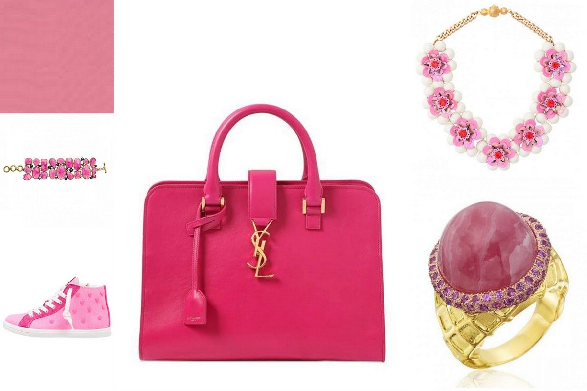
A color that does not need any extra explanation, right? I have two ice cream addicts living with me, so I got it immediately when I read about this color being so hot. A far cry from shocking pink, this is actually a color that looks wonderful when your skin can use a bit of uplifting. This color actually can take a bit of fatigue, showing in your complexion, away!
7. Classic Blue
Safe, solid and sound. It is bold, yet comforting. It is cool but emanes security. Blue is the perfect color to combine with almost every of the other colors mentioned here.

8. Lucity green
A beautiful soft green, faded yet such a wonderful strong color. I love this color on my eyes too. You can find the most interesting jewelry and accessories with this color to brighten up a *safer* color like blue or grey.

9. Scuba Blue
This color is not really easy to define. But think neoprene and think about diving suits, you might get the idea. A beautiful color for a dress but works wonders with your accessories too. Again a color that might add an interesting contrast with Glacier Gray and Toasted Almond. Beautiful of Classic Blue.

10. Aquamarine
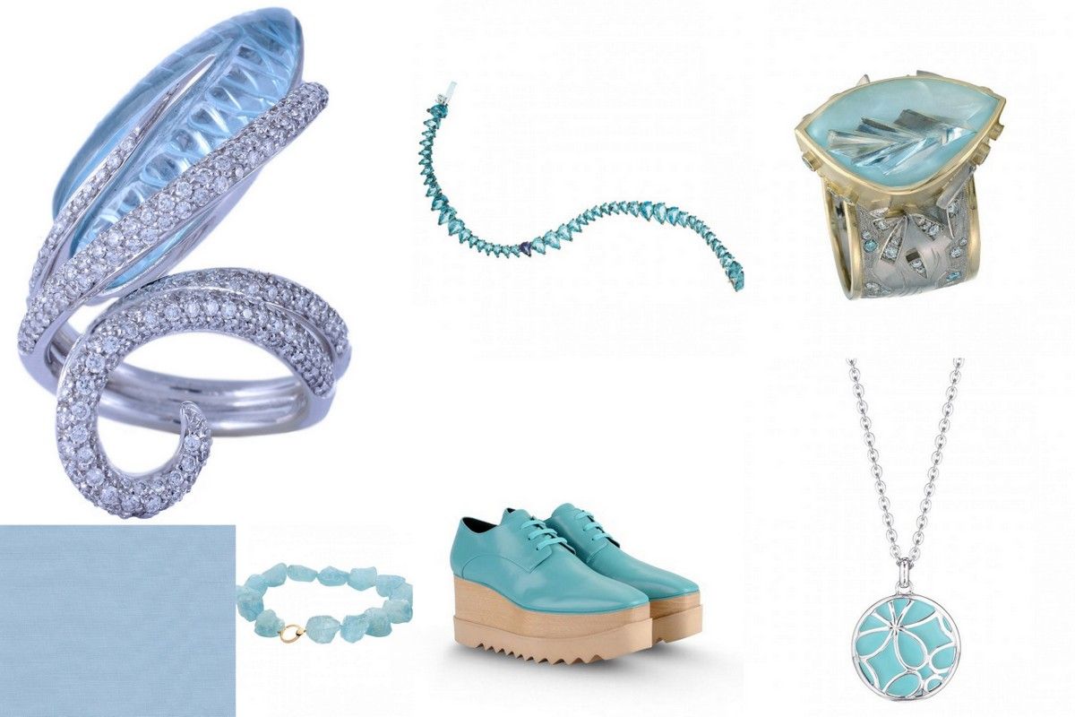
A color between the sky and the sea. A soothing color, great for bedrooms and people that need a safe, soothing and soft color. You never go wrong grabbing this color in the morning to wear. In jewelry and accessories it is a very sophisticated color. And of course, Aquamarine being a gemstone, there is so much choice out there!

© 2013 - 2025 Bizzita. All Rights Reserved
Legal Information | Copyright & Privacy Policy | Term & Conditions